← Social Media & Brand Identity

Harrison Dining. Logo concepts.

After learning that Harrison Dining’s logo was being considered for a redesign, I independently developed several concepts to contribute ideas to the creative process. I explored typography, iconography and layouts that could give the dining hall a more modern and recognizable identity while staying connected to SUNY Brockport’s brand.

Independent Concept · Not Commissioned
Previous Harrison Dining Hall logo with a chef hat
Previous logo
Concept 01
Concept 02
Concept 03

Color palette

Inspired by SUNY Brockport’s colors.

Deep Emerald Green#00573D
Golden Yellow#FFDE59
Porcelain White#F7F7F7

Typography

Main displayFUTURA
Secondary displaySPORTS WORLD

The concepts

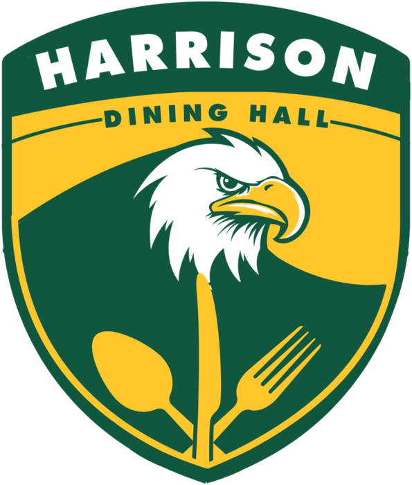
Harrison Dining Hall eagle badge logo concept
Concept 01

Eagle badge

The opportunity
Harrison Dining Hall needed an identity that felt connected to SUNY Brockport while remaining immediately recognizable as a campus dining location.
My approach
I created a badge-style logo that combines Brockport’s eagle imagery with a spoon, knife and fork.
Design decisions
The shield shape gives the logo a strong campus identity, while the eagle creates an immediate connection to Brockport and the utensils communicate the dining function without requiring additional explanation.
Outcome
The concept shows how Harrison Dining Hall could develop a recognizable sub-identity while remaining visually connected to SUNY Brockport.
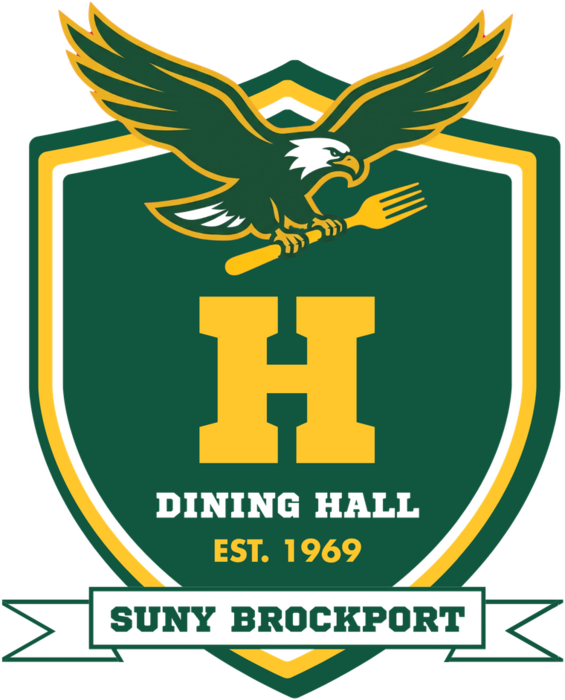
Harrison Dining Hall collegiate crest logo concept with a varsity H
Concept 02

Collegiate crest

The opportunity
This direction explores a more traditional collegiate identity for Harrison Dining Hall: an emblem that feels established, recognizable and closely connected to SUNY Brockport.
My approach
I built the concept around a shield, a varsity-style “H” and Brockport’s eagle imagery. The eagle carrying a fork connects school spirit with the dining experience, while the banner identifies it as part of SUNY Brockport.
Design decisions
The shield and block lettering draw from classic university crests and athletic branding. Green, gold and white preserve Brockport’s visual identity, while the oversized “H” gives Harrison its own symbol.
Outcome
This concept presents Harrison as an established campus institution with a stronger sense of tradition and school pride, and could translate across signage, uniforms, merchandise and digital materials.
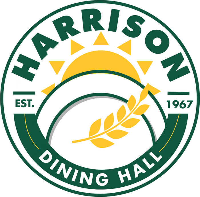
Harrison Dining Hall circular seal logo concept with a serving dish, wheat and rising sun
Concept 03

Hospitality seal

The opportunity
This direction explores a warmer, more hospitality-focused identity for Harrison Dining Hall, emphasizing food, nourishment and community.
My approach
I created a circular seal featuring a covered serving dish, wheat and a rising sun. These elements shift the focus toward the dining experience while the green-and-gold palette keeps the connection to Brockport.
Design decisions
The circular structure feels welcoming and versatile. The serving dish communicates hospitality, the wheat represents nourishment, and the sun adds warmth. Curved typography unifies everything in one compact mark.
Outcome
This concept gives Harrison a friendly, food-centered identity that could work across menus, packaging, signage, uniforms and social media, and scales well to small sizes.